PROOFPOINT
Visual Identty
Client project context
Visual identity design for Proofpoint︎︎︎, a cybersecurity company.
Executed during my time at Godfrey Dadich Partners︎︎︎
Credits
Kyle Watson - Creative Direction and Motion Graphics
Stravinski Pierre - Design
Maria Boado - Design
PROBLEM
Proofpoint, a human-centric cybersecurity company, needed a refreshed visual identity to better communicate its mission of protecting individuals' data. The challenge was to move away from traditional cybersecurity imagery and create a dynamic, flexible design that reflects the company’s core focus on human defense.
SOLUTION
We developed Proofpoint's visual identity by extending its existing visual system to refresh the brand image. This included a cohesive color palette, typography system, peelable, and various applications.
As a human-centric cybersecurity company, Proofpoint inspired us to design a protective barrier symbolizing the defense of people's data, metaphorically built from people. Instead of the traditional shield commonly used in cybersecurity branding, we created a dynamic force field with the human at its core. This barrier reflects Proofpoint's four main solutions through four different types of wedges that can be mixed and matched.
MY ROLE
This project was collaborative and carried out on a shared board in Figma. We began by brainstorming ideas to define the visual system, maintaining a flat hierarchy. Stravinski and I proposed initial concepts, and Kyle later joined to help refine and finalize them. Together, we made decisions about the color palette, typography, and other visual elements, and prepared presentations for feedback rounds and the brand guidelines. All visual deliverables created by me went through Kyle or Stravinski's review first, who provided feedback as needed.


The color palette was carefully chosen to balance technology and humanity, adding emphasis, depth, and progression.
For typography, we retained Inter, the typeface Proofpoint previously used, as it complemented the new system well, ensuring consistency and clarity.


The primary and secondary palettes are used for backgrounds, wedges, patterns, and type treatments, following a hierarchy for application.
The tertiary palette is reserved for graphs, alerts, and extra assets.
The tertiary palette is reserved for graphs, alerts, and extra assets.

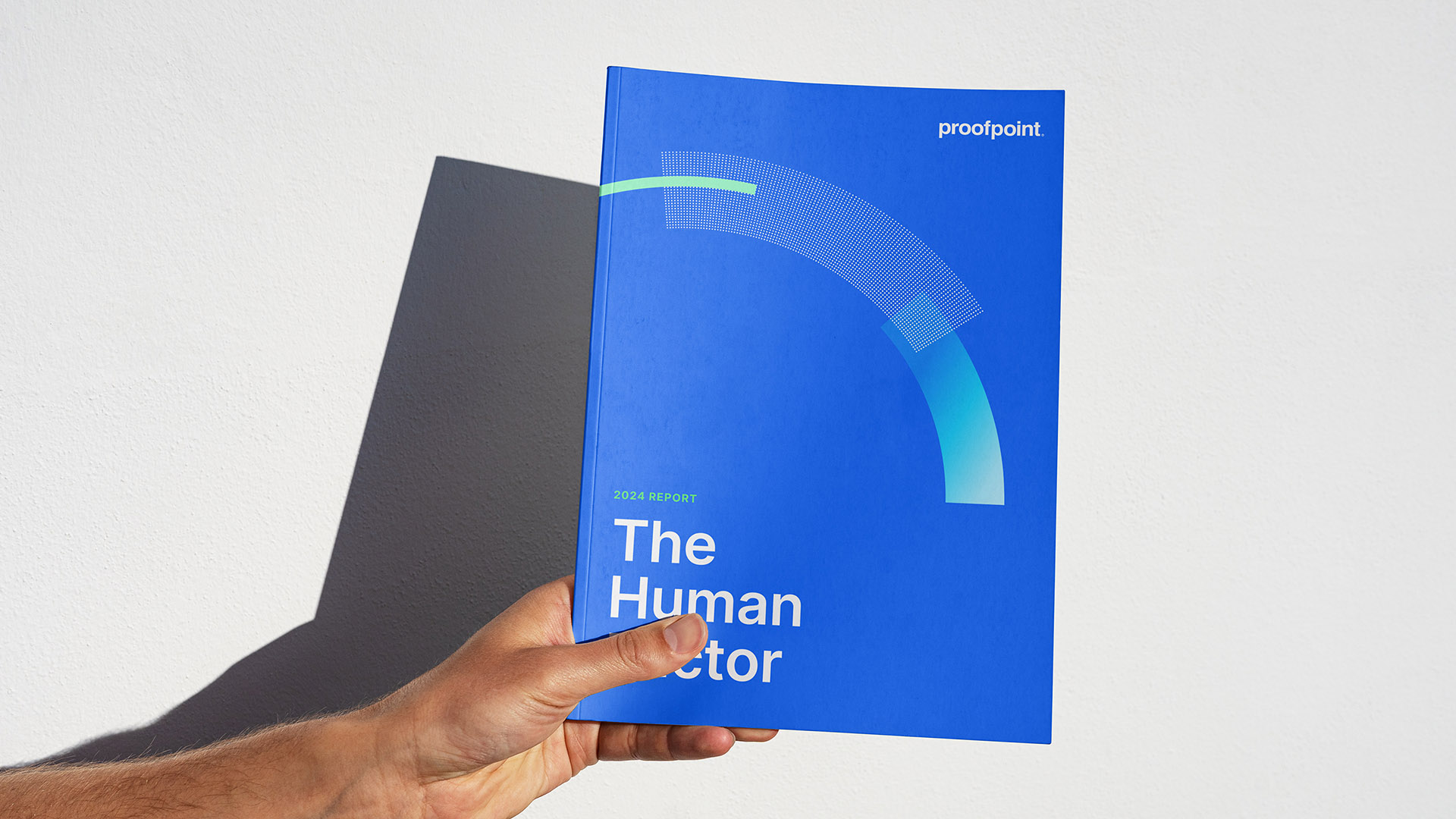
THE BARRIER
The Barrier compositions consist of 3–5 wedges: a flat color, a gradient, and up to two patterns. Each wedge represents a Proofpoint solution, and the wedges can be arranged in various ways to create unique, dynamic compositions.
The Barrier compositions consist of 3–5 wedges: a flat color, a gradient, and up to two patterns. Each wedge represents a Proofpoint solution, and the wedges can be arranged in various ways to create unique, dynamic compositions.

WEDGE GUIDANCE
Depending on the width, it is more appropriate to use one type of wedge or another.
Depending on the width, it is more appropriate to use one type of wedge or another.

PATTERN GUIDANCE: DOTS
When applying the dots pattern to a wedge, the radial pattern must be positioned at the edge of the circumference, and the ends should be terminated cleanly.
There are two pattern sizes designed to fit different composition scales to avoid large dots or a moiré effect.
When applying the dots pattern to a wedge, the radial pattern must be positioned at the edge of the circumference, and the ends should be terminated cleanly.
There are two pattern sizes designed to fit different composition scales to avoid large dots or a moiré effect.

PATTERN GUIDANCE: LINES
When applying the lines pattern, the lines should fit cleanly in the wedges. Terminate the ends in places that retain clean edges.
When applying the lines pattern, the lines should fit cleanly in the wedges. Terminate the ends in places that retain clean edges.

THE BARRIER:
WEDGE PROPORTION
Each type of wedge has a recommended maximum percentage it should occupy within the barrier.
The different wedges will then be adjusted in size to create a harmonious composition.
WEDGE PROPORTION
Each type of wedge has a recommended maximum percentage it should occupy within the barrier.
The different wedges will then be adjusted in size to create a harmonious composition.

THE BARRIER:
LAYERING HIERARCHY
Consider the stacking order of the barrier’s wedges in regard to density.
Heaviest falls to the bottom, while the lighter, thinner elements of the composition rise to the top.
LAYERING HIERARCHY
Consider the stacking order of the barrier’s wedges in regard to density.
Heaviest falls to the bottom, while the lighter, thinner elements of the composition rise to the top.