ARACNIA
Typeface Design, Motion Graphics, Album Cover Design
Personal project context
Typeface design course at Parsons School of Design, New York.
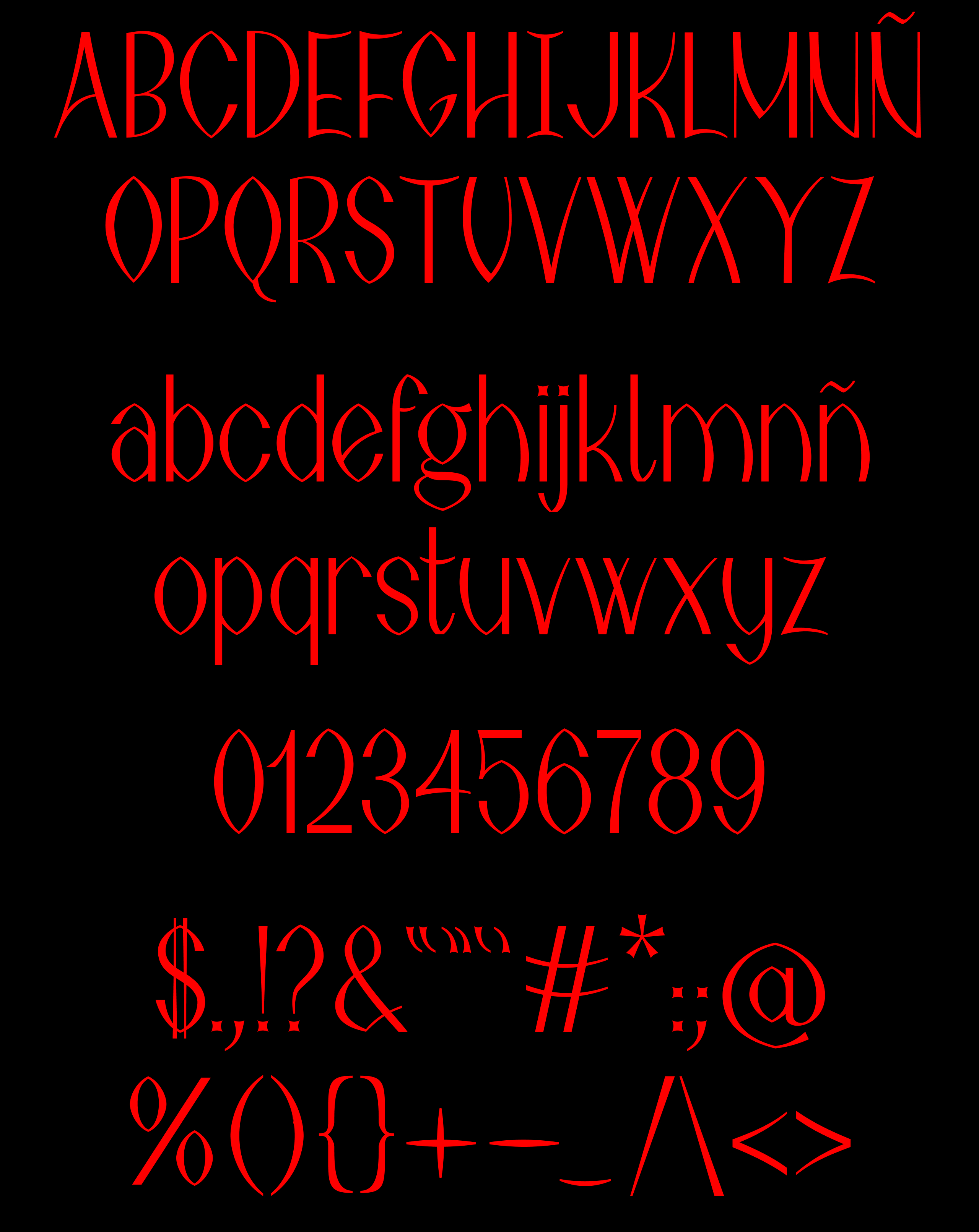
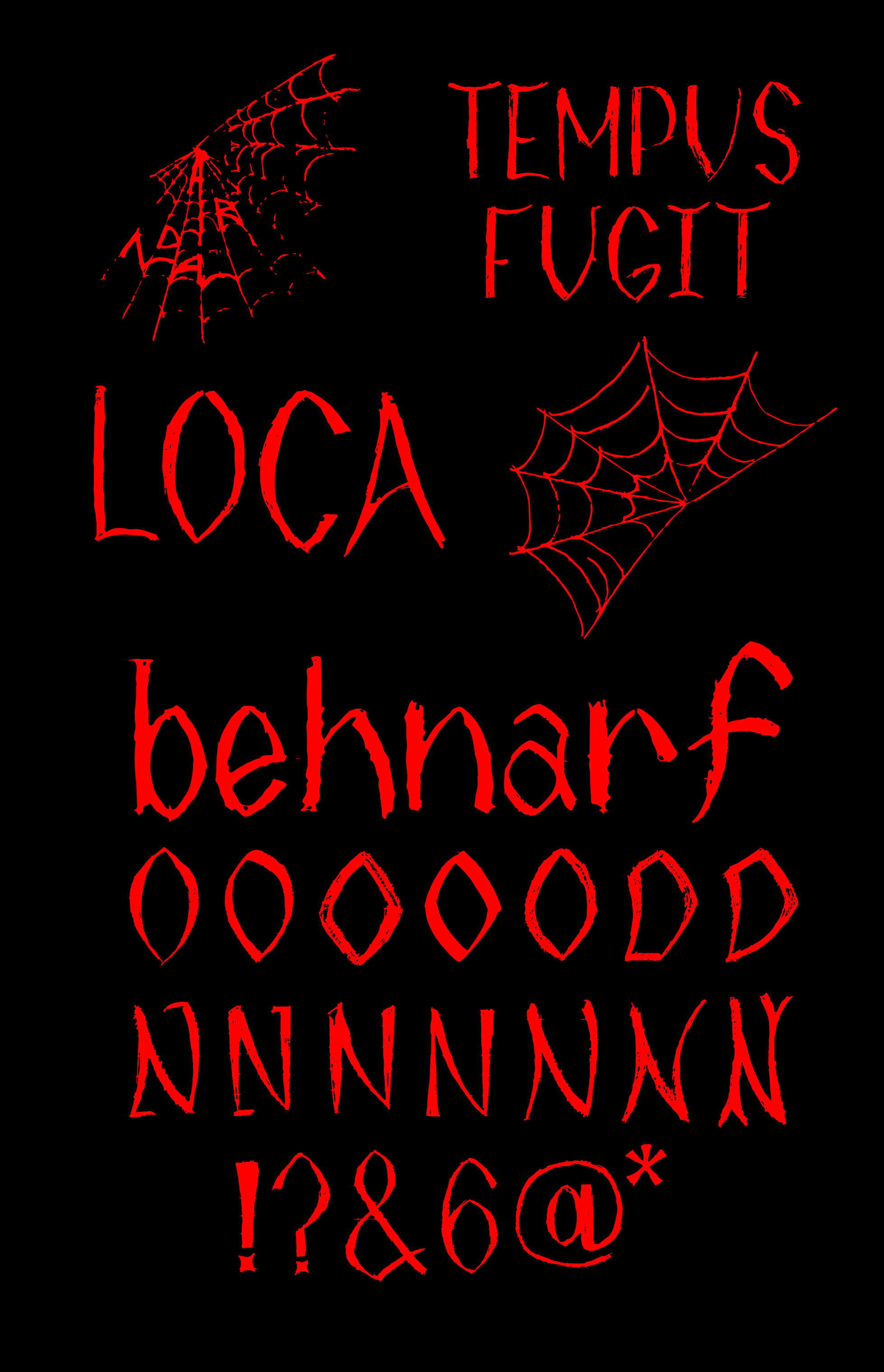
Sans-serif typeface with high contrast inspired by spiderweb patterns. Accompanied by an album cover design and various animations to showcase its expressive personality, scales, and features.

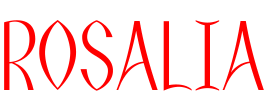
Aracnia is designed through an expansion contrast. In the thick strokes, a straight and regular structure is followed, while in the thin strokes, the contrast transitions from broader to narrower.
This contrast is employed in the thin strokes to symbolize the tension of a spider's web stretching and hooking from one part of the character to another.
This contrast is employed in the thin strokes to symbolize the tension of a spider's web stretching and hooking from one part of the character to another.

For round characters, the contrast operates differently. The spider web would stretch to each side, leaving greater contrast on the sides and two sharp points at the top and bottom. Additionally, in uppercase, the
round characters are wider at the top than at the bottom, creating the illusion that they are stretching and are inverted, providing spookier feel.
In lowercase, the predominant structure is the one present in the round characters. However, a consistent width is maintained both above and below to facilitate its rhythm and enhance readability in body text, without being as expressive as the uppercase.
In lowercase, the predominant structure is the one present in the round characters. However, a consistent width is maintained both above and below to facilitate its rhythm and enhance readability in body text, without being as expressive as the uppercase.

Aracnia is a versatile typeface that, while easily associated with the horror genre, also adapts well to more edgy styles. It is perfect for album design due to the strong personality it presents.

